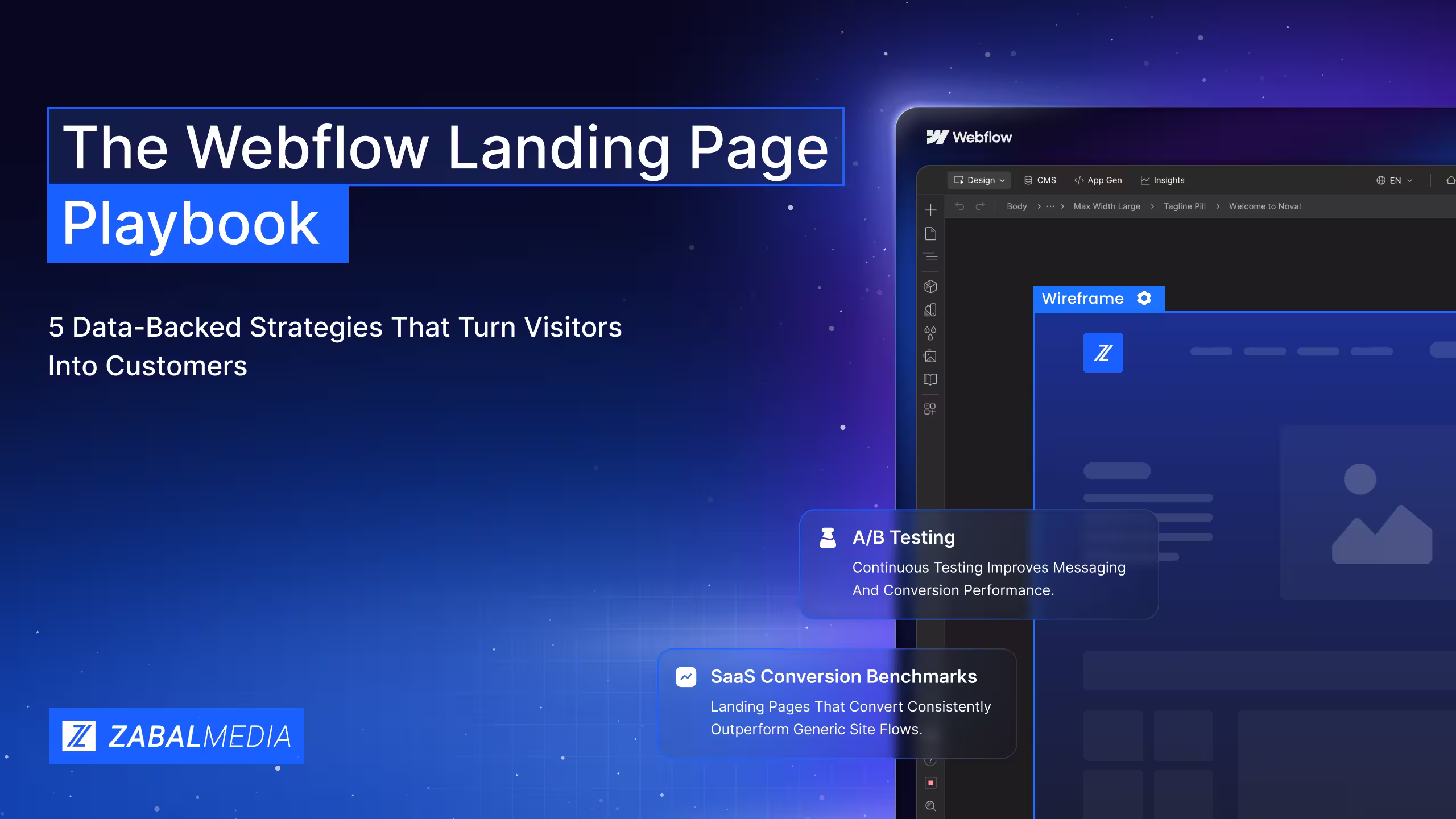
The Webflow Landing Page Playbook: 5 Data Backed Strategies That Turn Visitors Into Customers
A practical guide to building Webflow landing pages that improve clarity, speed, trust, and conversions.
.svg)
A high converting landing page is not just designed well. It is structured to make the next step clear, valuable, and easy.
A landing page can look beautiful and still fail to convert.
For enterprise marketing teams, the difference between a page that collects traffic and a page that generates pipeline usually comes down to structure, speed, messaging, and iteration. Webflow gives teams the flexibility to build faster, test smarter, and scale landing pages without depending on long development cycles.
This playbook breaks down the landing page elements that actually influence conversions, from page architecture and copywriting to mobile performance, CTA design, and A/B testing.
Use it as a practical checklist before launching your next campaign, product page, or conversion focused Webflow experience.
What’s Inside This Playbook
This guide combines conversion research, landing page benchmarks, and Webflow specific tactics into a practical framework your team can implement.
- Conversion benchmarks by industry
- Webflow workflows
- A/B testing frameworks
- Mobile optimization checklists
- CTA and form formulas
- Page speed recommendations
Start with the section that matches your current bottleneck. If your pages are getting traffic but not leads, focus on messaging and CTAs. If users are dropping off on mobile, start with speed and responsive design. If performance is unclear, begin with tracking and testing.
01: The Anatomy of a High Converting Landing Page
The median landing page converts at 6.6% across industries, while top performing pages often reach 10% or more. The difference is not just design. It is architecture.
A high converting landing page uses a systematic stack of elements that guides visitors toward one clear action.
The 7 Element Conversion Stack
Hero Section
Your hero section should include a clear headline, supporting subheadline, and primary CTA above the fold. The goal is to answer three questions immediately: What is this? Why should I care? What should I do next?
Value Proposition
Your value proposition should communicate the main benefit within seconds. Focus on outcomes, not features. Instead of explaining what your product or service does, explain what it helps the visitor achieve.
Social Proof
Testimonials, client logos, case studies, and measurable results help reduce doubt. Strong social proof answers the visitor’s hidden question: Can I trust this company to solve my problem?
Visual Hierarchy
Contrast, spacing, layout, and directional cues should guide the eye toward the most important action on the page. A cluttered page creates hesitation. A clear page creates momentum.
Supporting Content
Use benefit sections, FAQs, comparison tables, process breakdowns, or objection handling sections to answer questions before they become reasons not to convert.
Trust Signals
Security badges, guarantees, privacy statements, certifications, awards, and relevant credentials can help visitors feel safer taking action. This is especially important for B2B, healthcare, finance, SaaS, and enterprise buyers.
Primary CTA
Every landing page should have one main conversion goal. The CTA should be specific, visible, and tied to the visitor’s desired outcome. Personalized CTAs can outperform generic ones because they feel more relevant to the user.
Webflow Advantage
Build each section as a reusable component. Your team can design once, reuse across multiple pages, and update globally when messaging or branding changes.
02: Headlines and Copy That Demand Attention
Your headline is one of the highest impact elements on the page. A strong headline can immediately clarify the value of the offer. A weak headline can make even the best page feel confusing. Every word on your landing page should earn its place.
4 Proven Headline Formulas
Readability: The Silent Conversion Killer
Simple copy usually converts better than complicated copy. Visitors should not have to work hard to understand what you offer. Avoid jargon, shorten sentences, and use concrete language instead of abstract claims.
Instead of saying: AI powered analytics engine. Say: See exactly where you are losing customers. The second version is clearer because it focuses on the outcome.
Copy Principles That Convert
Lead with benefits, not features
Features explain what something does. Benefits explain why it matters.
Use the visitor’s language
Pull messaging from customer reviews, sales calls, support tickets, and common objections. The best landing page copy often sounds like your customer wrote it.
Keep one message per page
Every section should support the same conversion goal. If a section creates confusion or introduces a competing action, cut it.
Address objections early
Do not wait for the visitor to hesitate. Use supporting copy to answer common concerns around pricing, timing, complexity, trust, or implementation.
Quick Win
Run your copy through Hemingway Editor or a readability tool. Aim for clear, simple language and test a simplified version against the original.
03: Visual Design and Emotional Engagement
Landing page design is not only about how a page looks. It is about how easily a visitor can understand, trust, and act. Every image, animation, layout decision, and color choice should support the conversion goal.
The Power of Video
Video can help explain complex offers, build trust, and show outcomes faster than text alone. For landing pages, the best videos are usually under 90 seconds, benefit focused, easy to understand without sound, centered on the buyer’s problem, and placed near a key decision point.
Color Psychology for Conversion
Webflow Interactions and Design Principles
Webflow’s native interaction system makes it possible to create scroll reveals, hover effects, entrance animations, and lightweight motion without custom JavaScript. Used well, interactions can create a more polished experience. Used poorly, they can distract from the action you want the visitor to take.
- Use directional cues to guide attention toward CTAs
- Maintain generous whitespace around conversion elements
- Make the CTA the highest contrast element on the page
- Limit the color palette to two or three core colors plus one CTA accent
- Use motion to clarify, not distract
- Show outcomes, not just products. People want transformation.
04: Conversion Centered CTAs and Form Design
Your CTA is where interest turns into action. Generic CTAs like Submit or Learn More often underperform because they do not communicate value. Strong CTAs tell the visitor exactly what they will get and why it matters.
Form Optimization: Less Is More
Form design is where many conversion leaks happen. Every unnecessary field can reduce completions. The goal is to collect the information you need without making the visitor feel like the form is too much work.
Keep forms short
Three to five fields is usually a strong starting point. Name, email, and one qualifying question are often enough for an initial conversion.
Capture email first
If you need more information, collect it later through progressive profiling or sales follow up.
Use smart defaults
Pre fill fields where possible, such as country, company, or role.
Use progressive disclosure
Only show additional questions after the visitor completes the first step.
Add inline validation
Give users feedback as they type instead of waiting until they submit the form.
Reduce perceived effort
Use dropdowns, toggles, sliders, or multiple choice fields when possible.
Webflow Forms Tip
Use Webflow’s native form builder for simple forms with custom styling. For conditional logic, multi step forms, or more advanced flows, embed tools like Typeform, Tally, HubSpot, or a custom form solution.
05: Mobile First Design and Page Speed
Most landing page traffic now happens on mobile, but many landing pages are still designed for desktop first. That creates a major conversion gap. A mobile first landing page should be easy to read, fast to load, simple to navigate, and effortless to complete with one hand.
Mobile First Webflow Workflow
Thumb friendly targets
Buttons should be large enough to tap comfortably, with enough spacing between elements.
Single column stacking
Multi column sections should stack clearly on mobile. Use Webflow flexbox and grid settings to control how each section reflows.
Simplified navigation
On mobile, navigation should not compete with the conversion goal. Keep the path simple and focused.
Touch optimized forms
Use larger inputs, appropriate keyboard types, and avoid interactions that depend on hover states.
Compressed media
Use WebP images, lazy load below the fold, and consider removing autoplay videos on mobile.
Page Speed Optimization
Page speed directly affects conversion. A page that loads quickly creates trust and keeps visitors engaged. A slow page creates friction before the visitor even sees the offer. Webflow provides CDN hosting and automatic image handling, but your team should still optimize before publishing.
- Pre optimize images with tools like Squoosh or TinyPNG
- Limit custom fonts to two families
- Use font display swap
- Minimize third party scripts
- Use Webflow’s native lazy loading for below the fold content
- Target an LCP under 2.5 seconds
- Keep CLS under 0.1
- Review performance on mobile, not just desktop
06: A/B Testing and Webflow Power Moves
Not every A/B test produces a meaningful result. The best teams do not test random button colors first. They test the elements most likely to influence a visitor’s decision.
Testing Best Practices
- Test one major variable at a time
- Run each test long enough to collect reliable data
- Document the hypothesis before launching
- Track the business outcome, not just the click
- Use failed tests as audience research
Webflow Specific Power Moves
Page Building and Templates
Designers can create controlled templates with approved sections. Marketers can then build new landing pages faster without risking design consistency.
CMS Powered Dynamic Content
Use Webflow CMS collections to personalize headlines, testimonials, case studies, and page content by audience segment, industry, campaign, or location.
Native Interactions Engine
Use scroll triggered animations, hover states, and lightweight motion without relying on custom JavaScript.
Clean Code and SEO
Webflow gives teams control over semantic structure, meta tags, alt text, sitemaps, and page level SEO settings.
Integrations
Webflow can connect with tools like Google Analytics, Meta Pixel, HubSpot, Zapier, Hotjar, Microsoft Clarity, Segment, and custom conversion pixels.
07: Industry Benchmarks and Conversion Data
Context matters. A 3% conversion rate may be strong for one industry and below average for another. Use benchmarks as directional guidance, not fixed rules. Your real goal is to improve against your own baseline while comparing performance to similar businesses and traffic sources.
Ready to Build Pages That Convert?
Start with the area showing the biggest gap between your current performance and the benchmarks above.
Maybe your page needs a clearer headline. Maybe the form is asking for too much. Maybe the mobile experience is too slow. Or maybe your team needs a faster way to build and test landing pages without waiting on development resources.
The goal is simple: create landing pages that make the next step obvious and easy.
For enterprise marketing teams, Webflow can help reduce build times, improve page performance, and make campaign execution more scalable.
Want to see how a Webflow site can reduce costs, improve performance, and help your team move faster?
Schedule a free strategy call with Zabal Media to learn how our team builds scalable Webflow experiences for growth focused brands.
Share this article
Zabal Journal
Related Content

Zabal Media: Webflow Enterprise Agency of the Year
As the leading Webflow Enterprise Agency, Zabal Media has helped clients manage their projects and transform their marketing and design processes.

Unlock Success with a Top Webflow Enterprise Agency Partner
Learn how Zabal Media has come to serve the world’s top enterprise B2B tech, eCommerce and agencies and what they have to say about our award-winning Webflow design, development and digital marketing
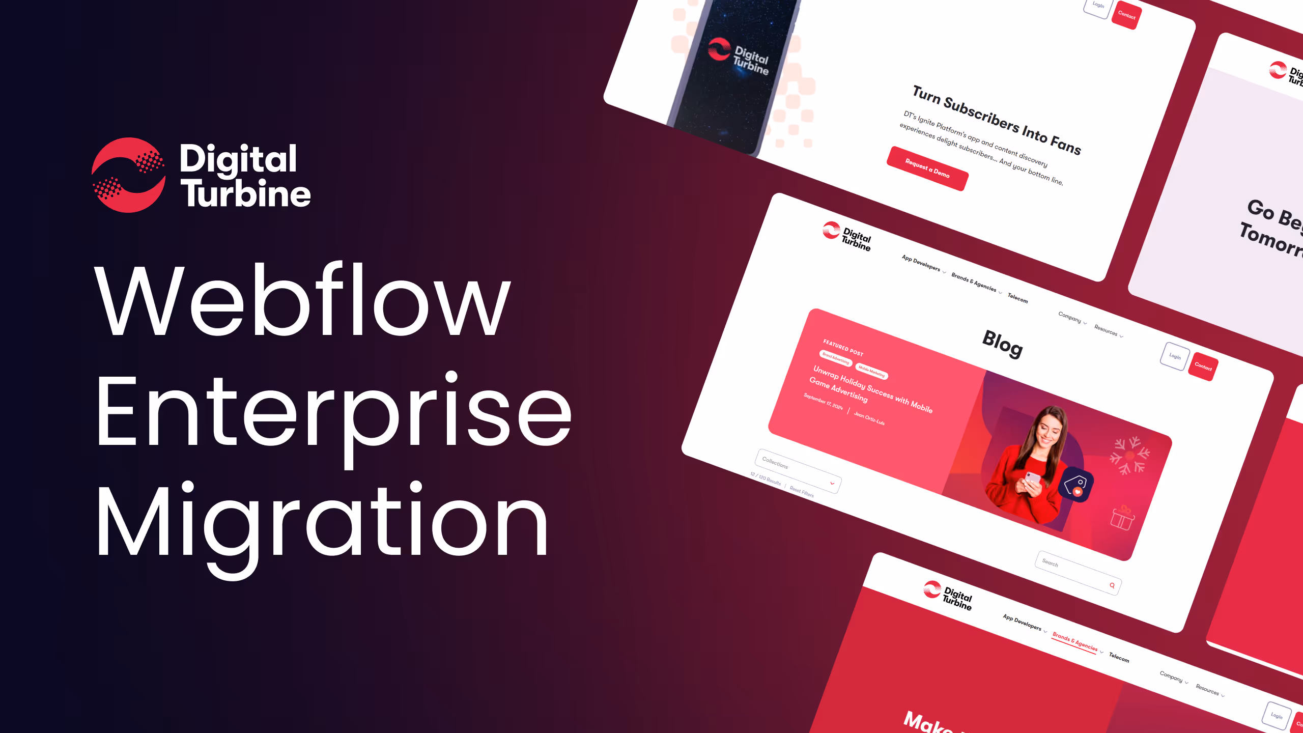
How Zabal Delivered a Seamless Webflow Enterprise Migration in Just 11 Weeks
From WordPress to Webflow: How Digital Turbine Scaled Their Website, Boosted Traffic, and Gained Full Control Over Their Content