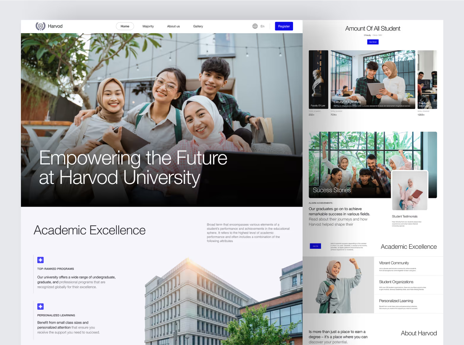
Overview
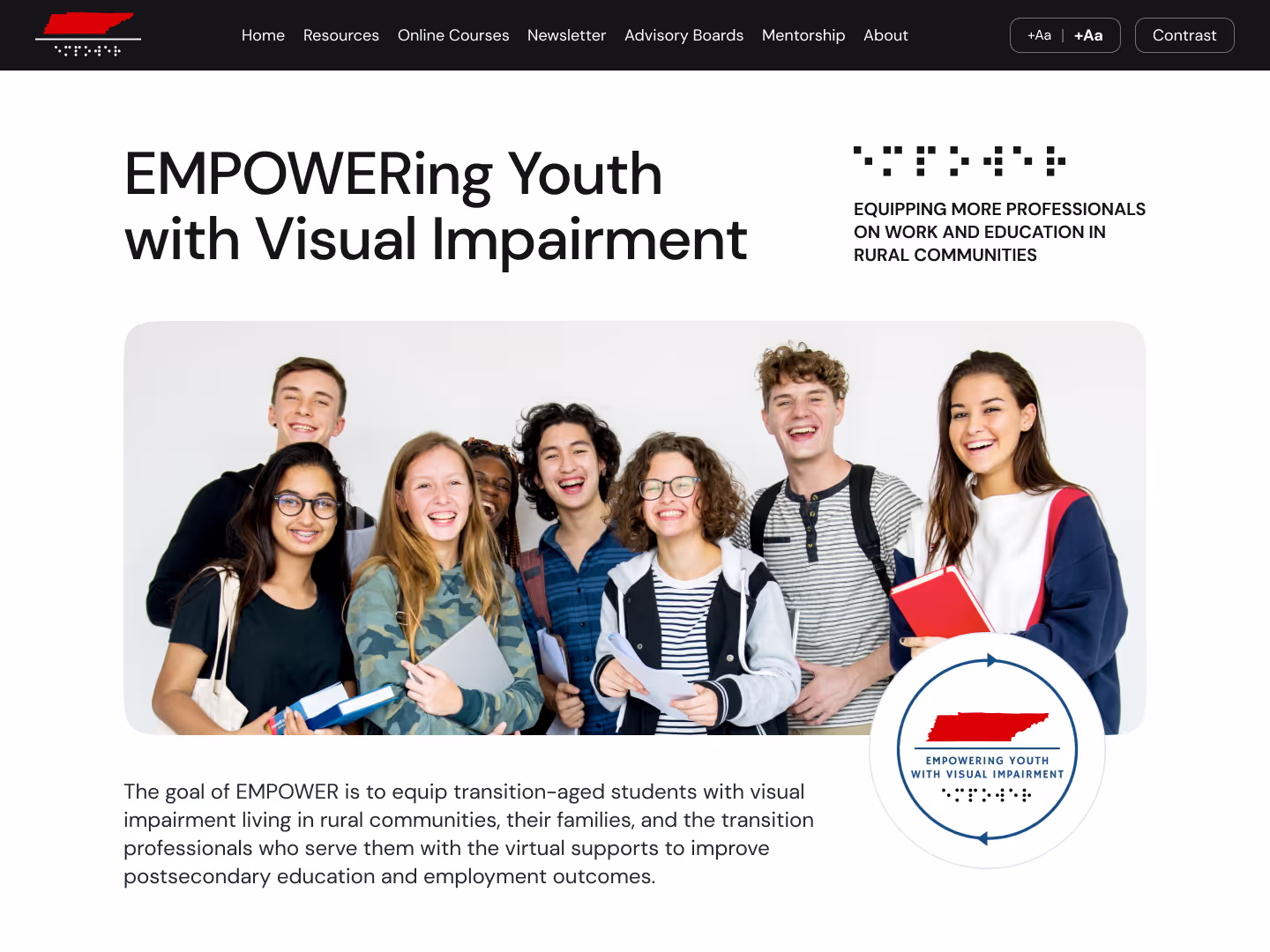
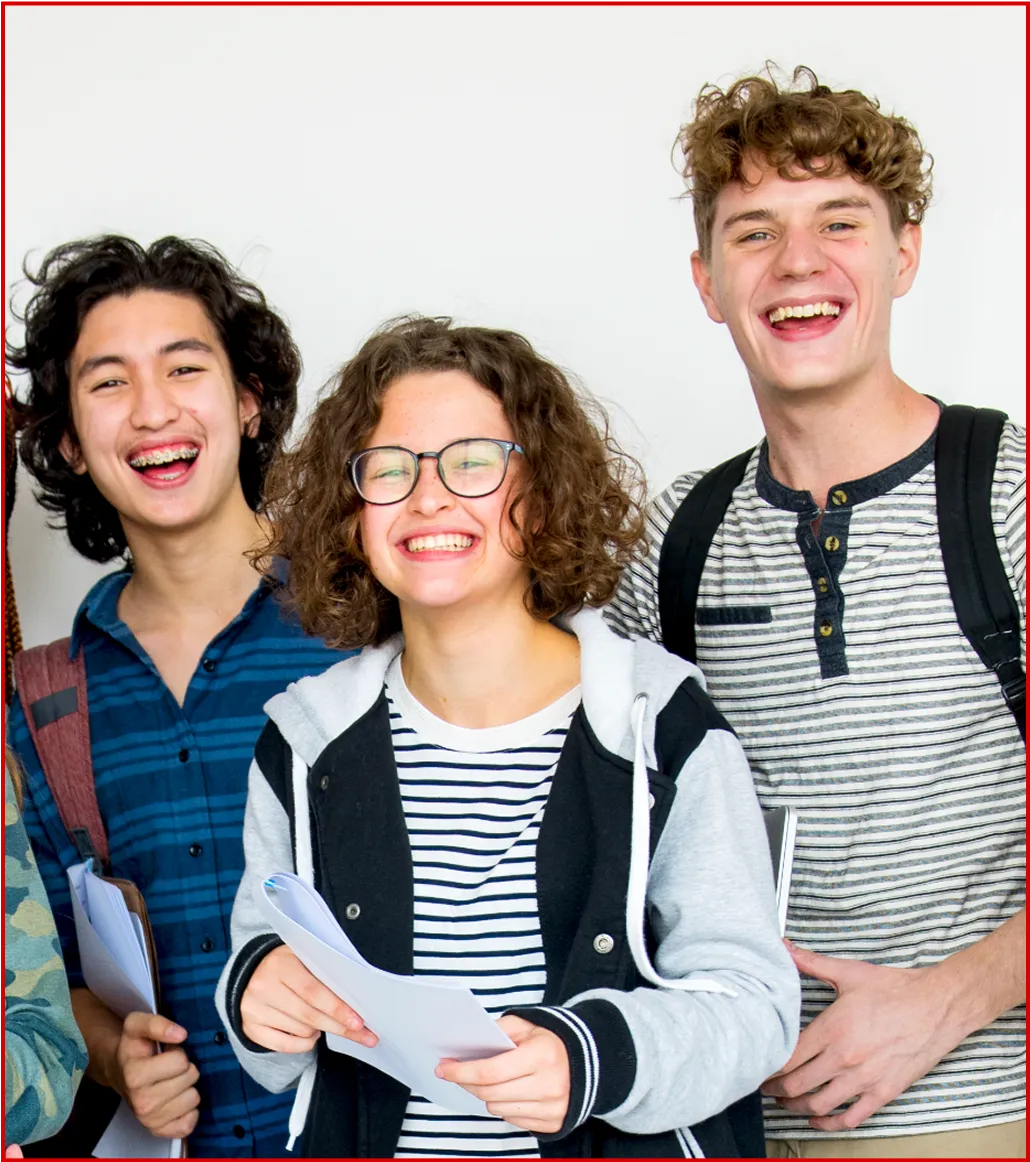
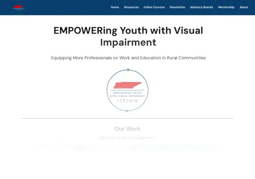
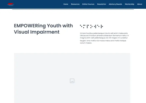
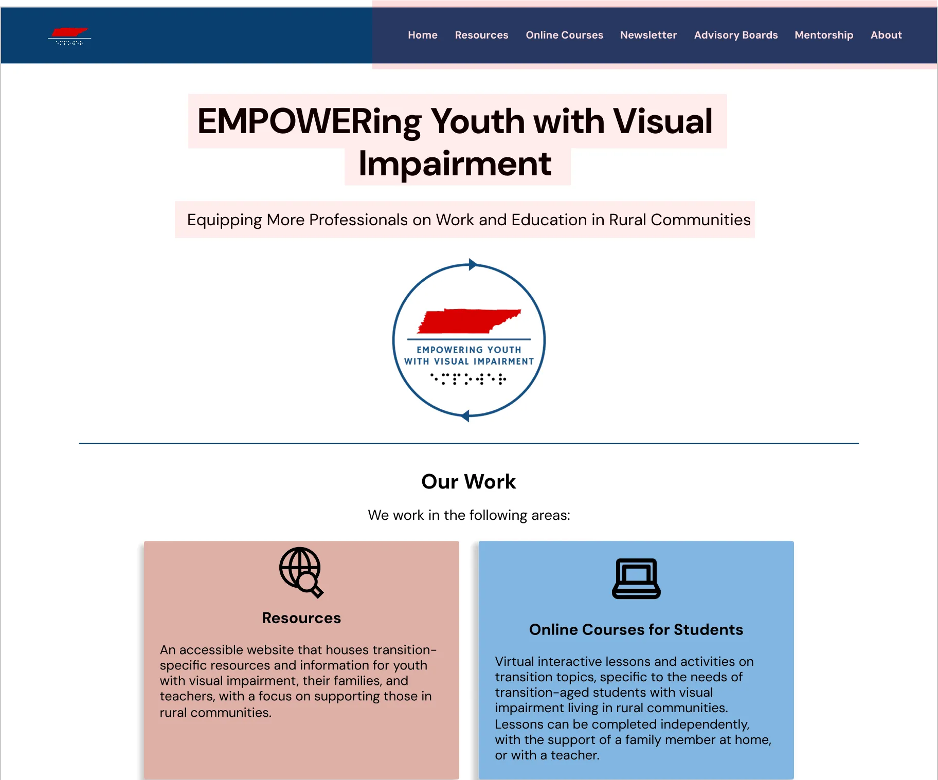
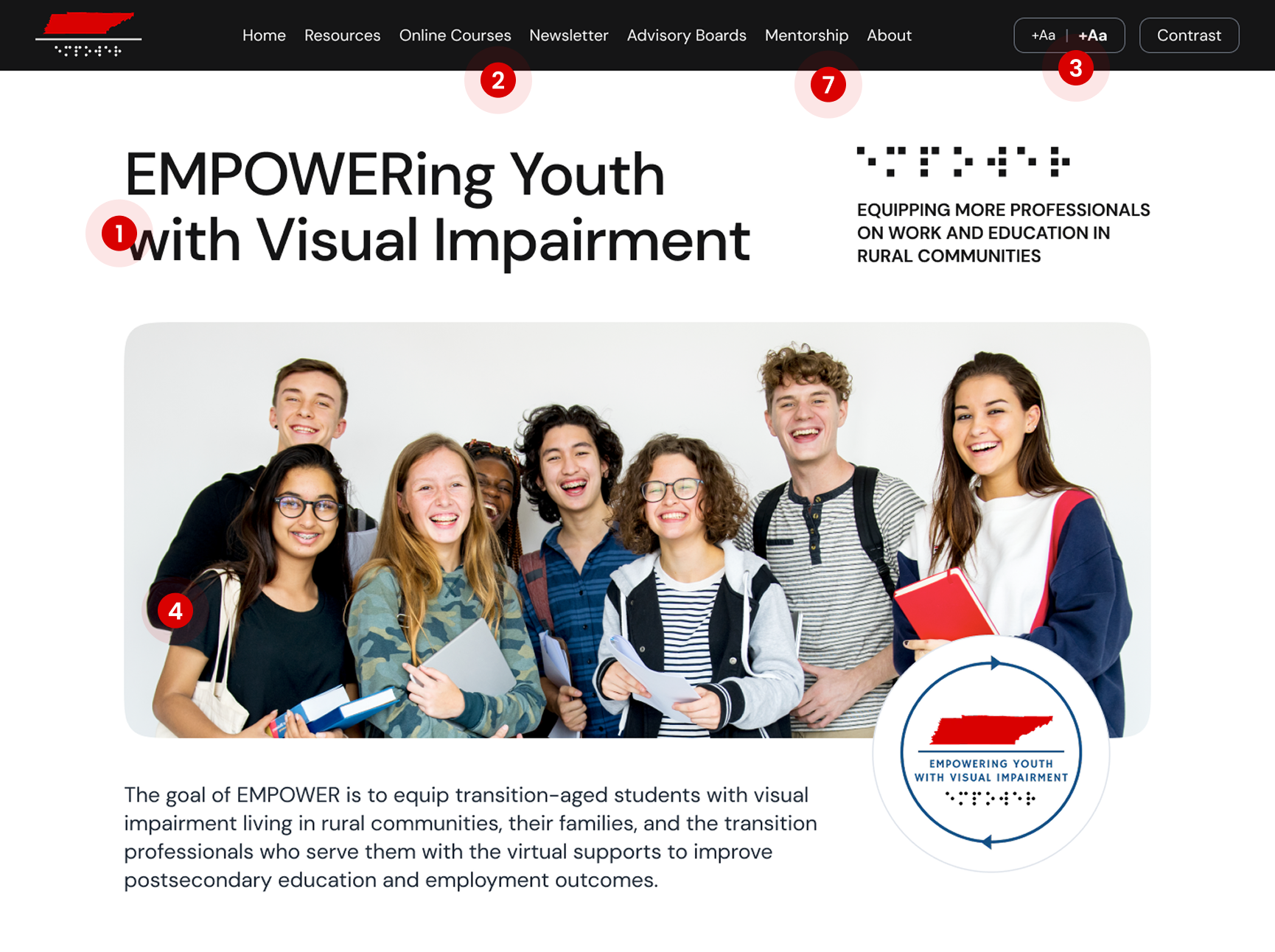
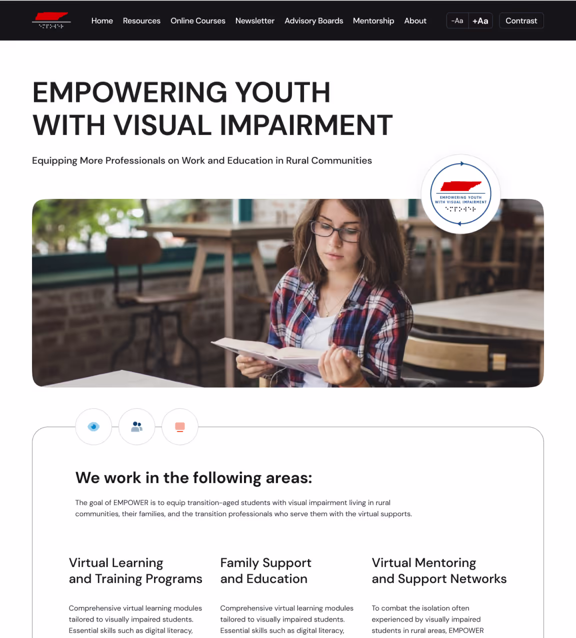
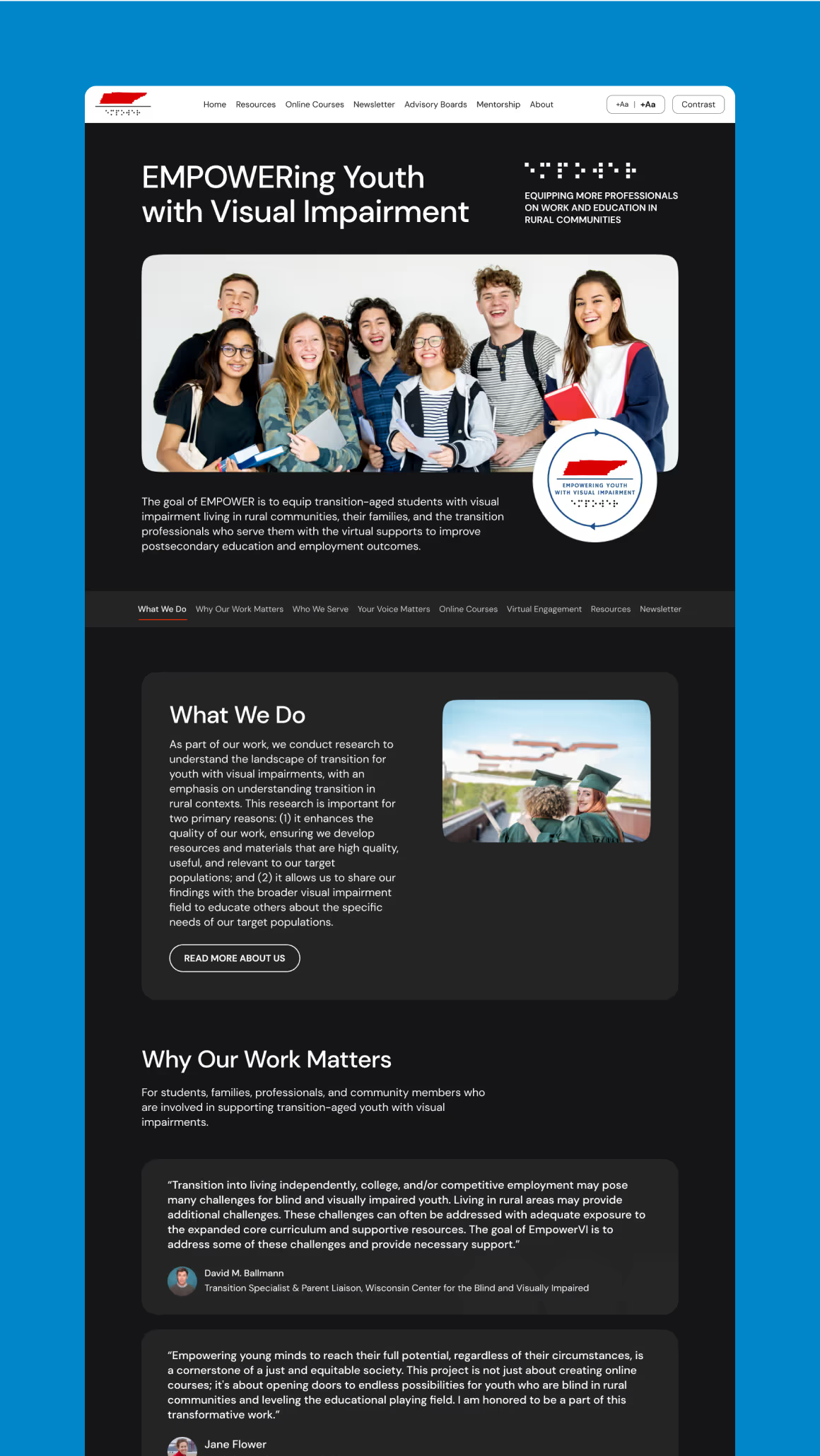
The goal of EMPOWER VI is to provide transition-aged blind and low vision students in rural communities, along with their families and transition professionals, with virtual tools to improve postschool outcomes. EMPOWER VI, an Office of Special Education Programs (OSEP)-funded project housed at Vanderbilt University, partnered with our team to elevate their website, making it both accessible, highly informative, and visually appealing.
Accessibility was the core focus of our partnership. We were committed to ensuring an inclusive experience for all students, families, and professionals to easily learn about the EMPOWER VI initiative and access critical resources. The redesigned site reflects the initiative's mission while removing barriers to engagement. It also incorporates user-friendly navigation and design elements that meet the needs of both sighted and blind/low vision users. This ensures the platform can be equitably accessed by all stakeholders.


.avif)
.avif)
Understanding the project
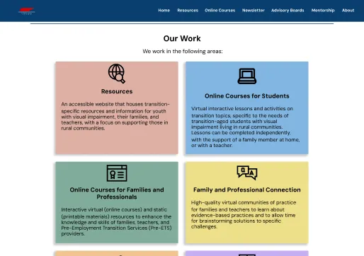
Project Goals
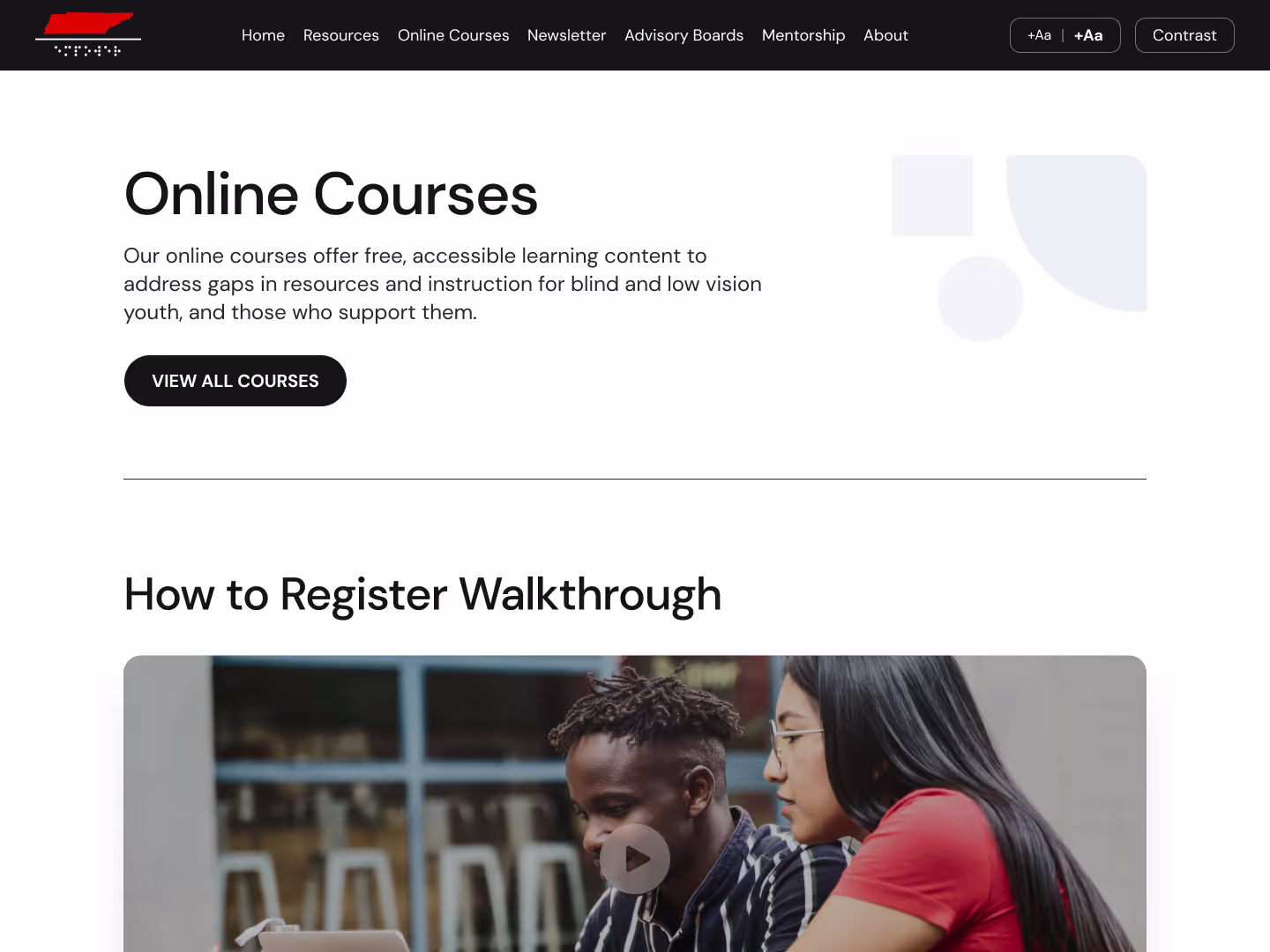
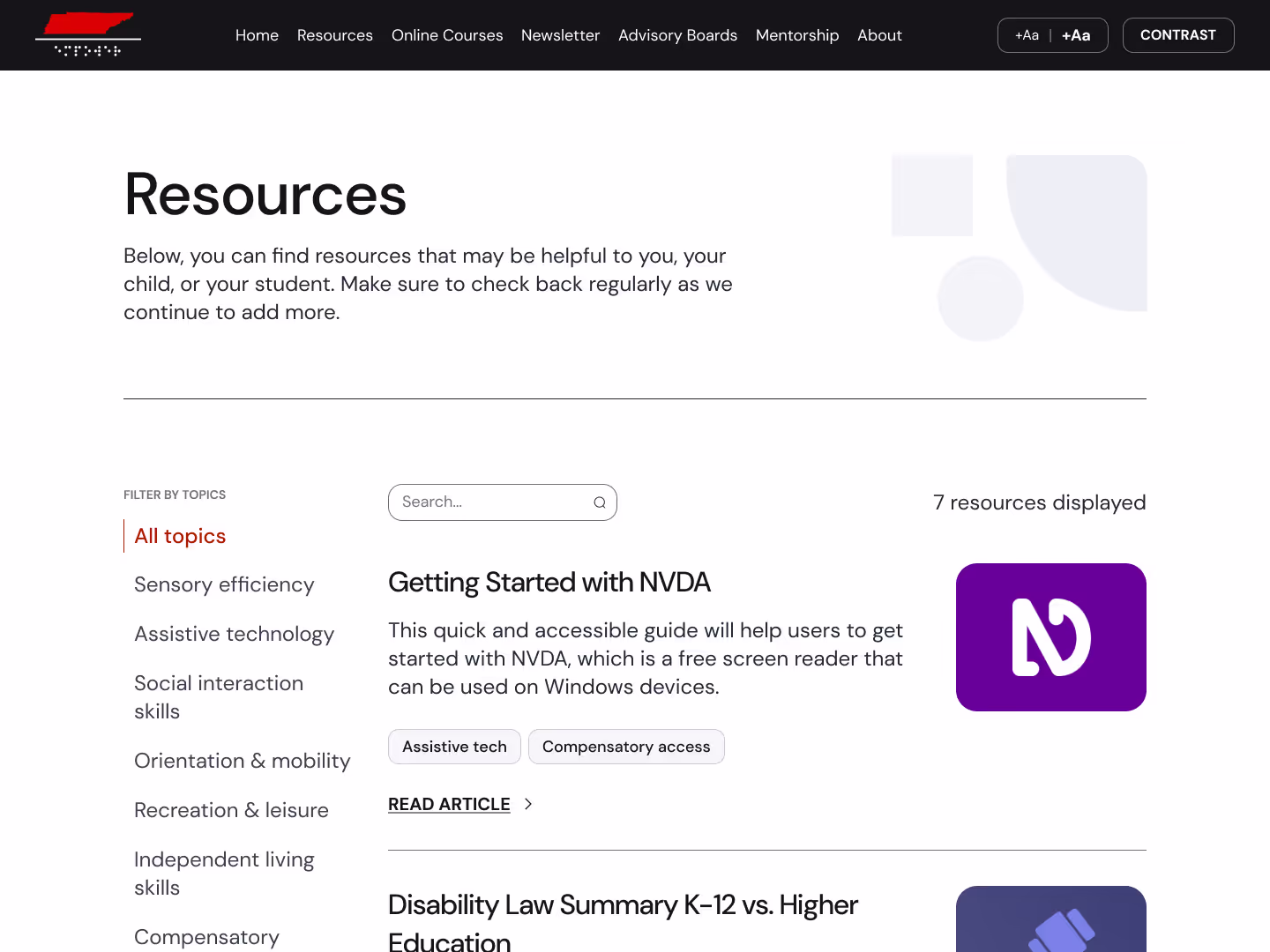
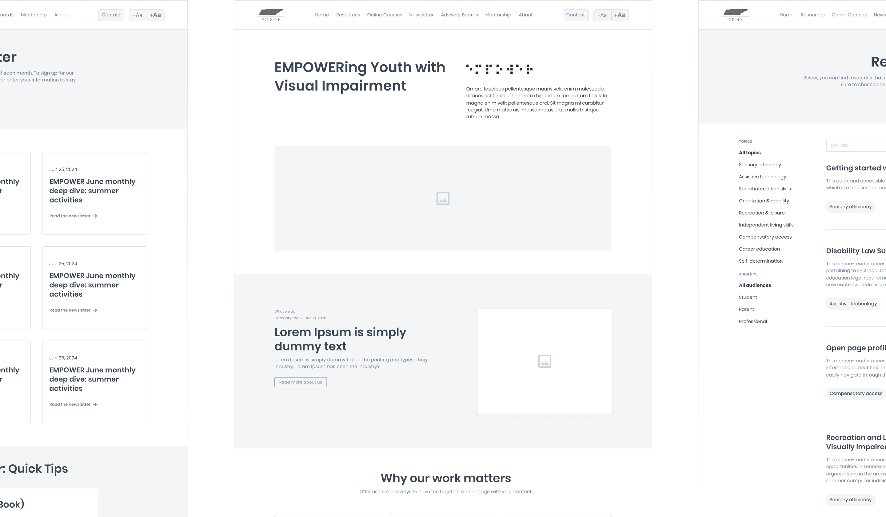
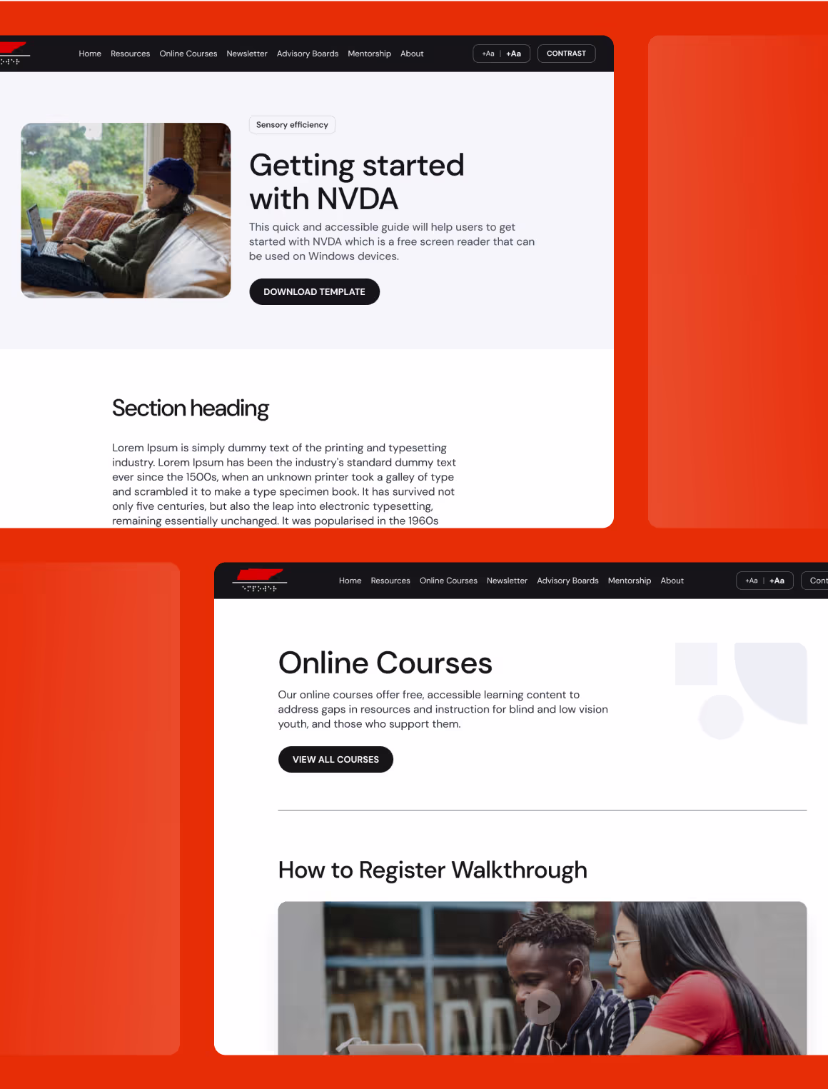
The EMPOWER VI project stood out from our typical work, as its goals were unlike many of our previous partners. Instead of focusing on building sales pipelines of demo requests, this initiative aimed to educate students, families, and professionals via an accessible content hub. The platform offers free, accessible learning resources to address gaps in secondary transition services for blind and low vision youth and their supporters. To achieve this, the website was designed to be easy to navigate, compatible with screen readers, fully optimized for A11Y and ADA compliance, while remaining aesthetically pleasing.
Project Challenge
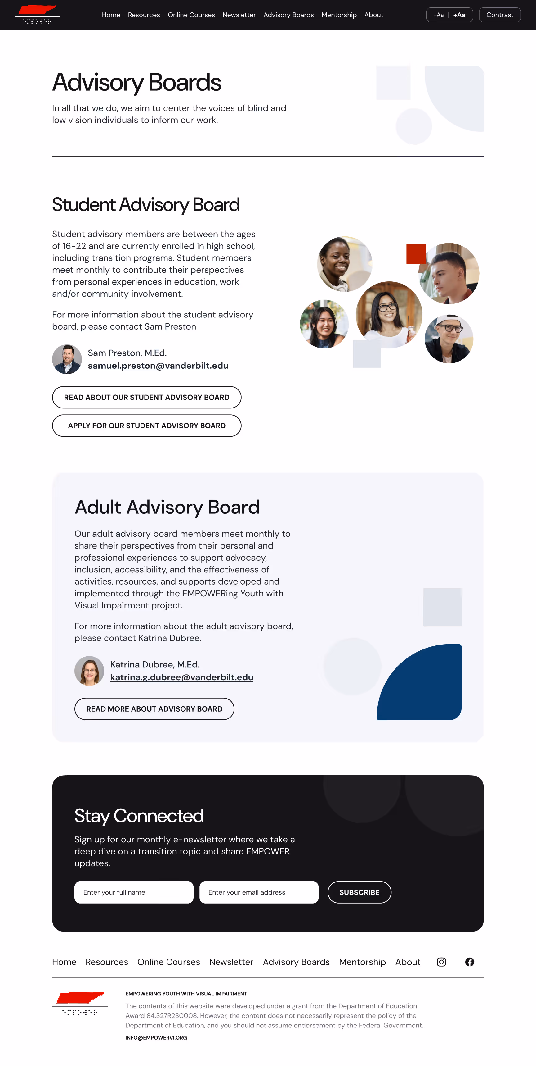
The project faced challenges in building and designing their own website. Although the EMPOWER VI team includes content and accessibility experts, they are not web designers. They were able to create a simple website, but it was not fully accessible and could not accommodate their growing amount of content. EMPOWER VI needed a central, accessible hub to benefit their primary audiences. As well, their website needed a visual design refresh to better align with their team's vision and goals.


Asking the right questions
Research goals
This project pushed our team to deeply understand the users, focusing on accessibility to ensure flawless navigation for both visually impaired and other users of content-rich sites. Our goal was to understand how to best blend usability with a clean, beautiful design, creating an inclusive and seamless user experience.
Inclusive Design
We designed the site with universal design principles. In this way, we ensured accessibility, usability, and a seamless experience for all users, regardless of functional vision.

ADA-Complianace
We built the site in accordance with ADA compliance rules to deliver an accessible, inclusive digital experience for all.

Seamless Access
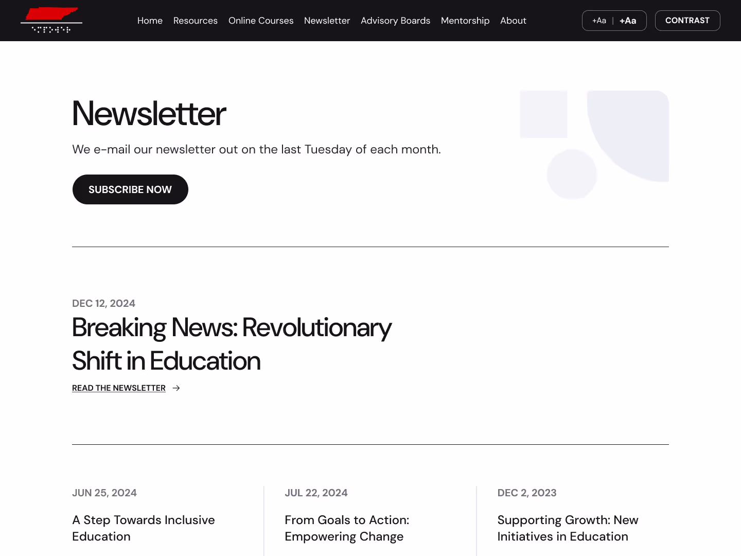
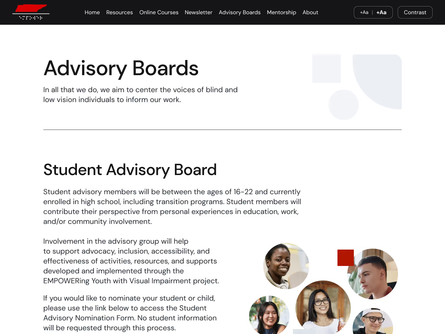
The content hub was designed to be easy to navigate, enabling users to effortlessly find and access valuable resources.
Scalable Performance
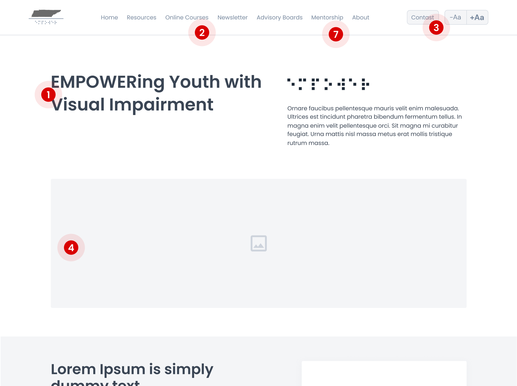
The site was designed with dark, white, and primary tones for clear content and high contrast. Text enlargement and contrast features are included on every page to support all users.
Accessibility & Inclusion Efforts

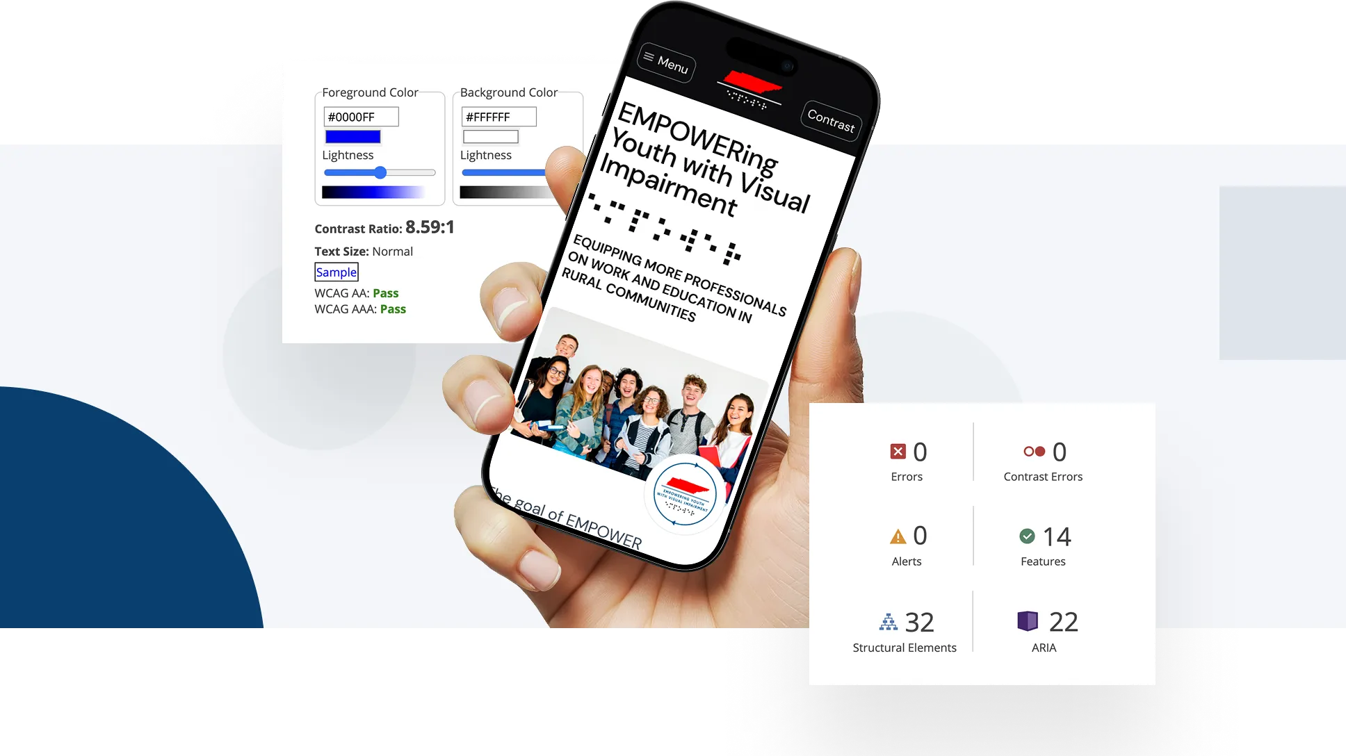
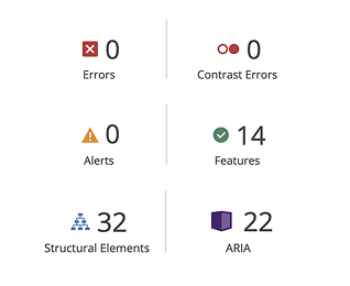
Documented all issues with screenshots, descriptions, and severity levels (we can take some screenshots from the Figma file to show the deliverables - UX Audit)


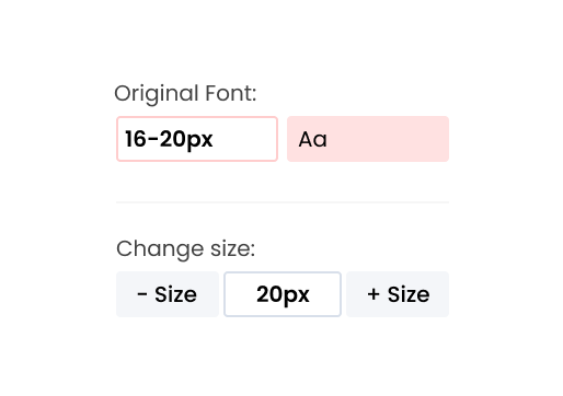
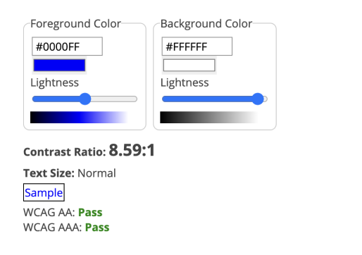
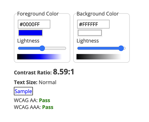

- Typography: Increase base font size (24px), allow user resizing.
- Color Palette: Adjust brand colors for proper contrast.
- Button/Link Sizes: Make bigger, minimum 44x44px touch areas.
- Focus Styles: Visible outlines (not just faint shadows).
- Form Fields: Add clear labels outside inputs, not just placeholders.
- Error Messages: Ensure they are text-based and visibly obvious.
- Navigation: Improve Tab order and landmarks.
- Gather feedback on usability, not just technical compliance.
- Check if the delivered & implemented designs are mobile-friendly
- Rerun automated and manual audits.
- Confirm WCAG 2.2 AA compliance.
- Fix anything still missing.
- Screen reader test: NVDA (Windows), VoiceOver (macOS)


- Launch the updated design.
- Set a process to test new features for accessibility before releasing them.
- Included an Accessibility Statement page showing our commitment and what users can expect.
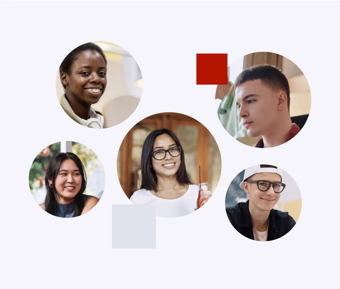
- Collect, evaluate, and implement qualitative feedback from real users, including members of the EMPOWER VI Adult Advisory Board (professionals from various states who are blind or have low vision.
Interface inspirations


Defining a visual direction
Balancing accessibility with visual appeal requires a thoughtful approach to combining legibility and creative design. Early on, we focused on incorporating accessibility into the site’s branding in a way that was both functional and visually appealing. As the design evolved, accessibility became seamlessly integrated, enhancing usability while keeping the brand fresh and relevant. This process demonstrated that accessibility and design can coexist to create a more impactful and cohesive experience.


Information architecture


Colors


Visual direction
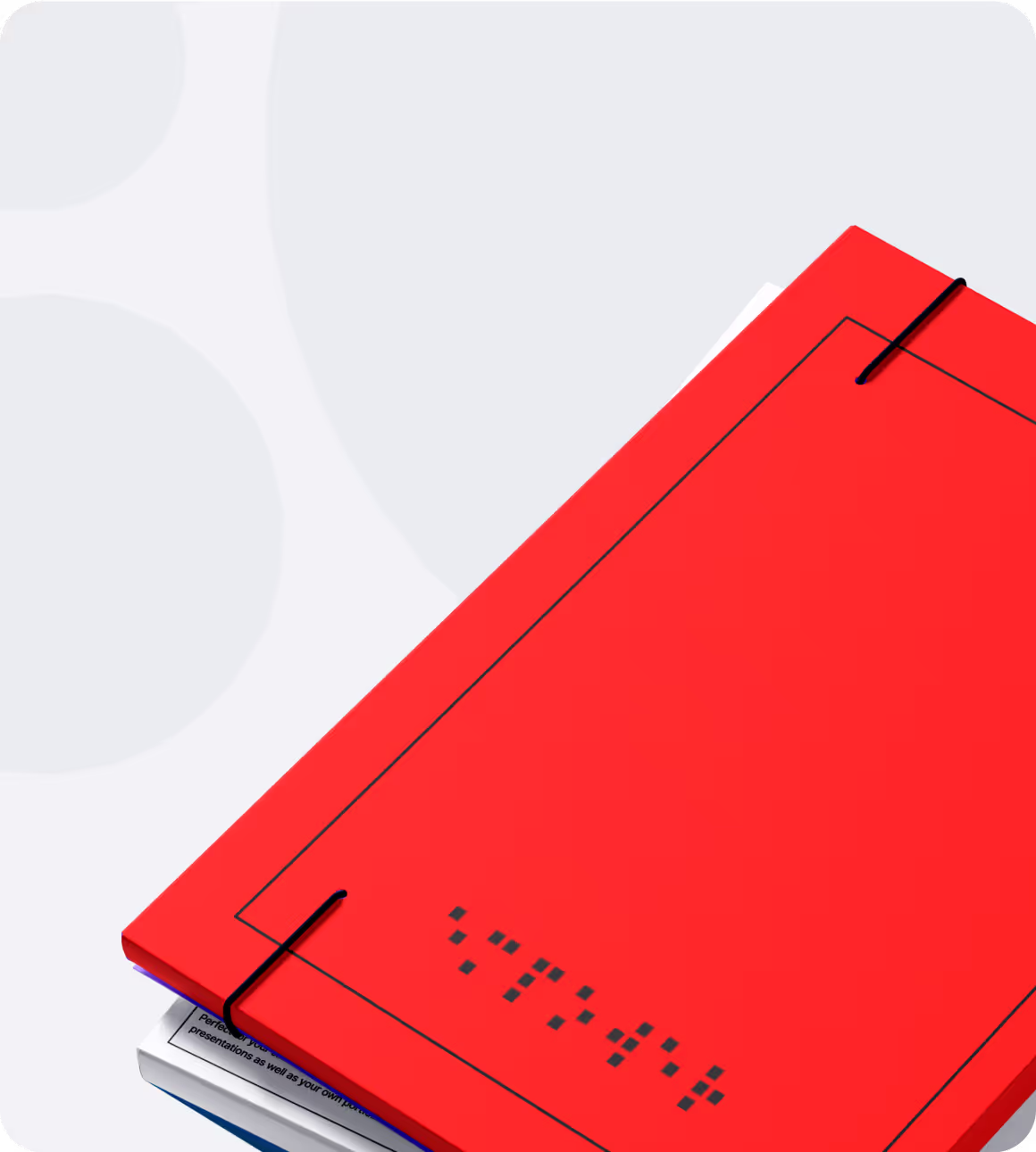
We found a way to infused braille into the visual design concepts, which deeply resonated with the EMPOWER VI team. It provided a fun approach, translating something tactile and familiar into a meaningful digital design element that bridged accessibility with innovation.

Visual design guidelines
Redefining familiarity with a creative twist
We partnered with the Vanderbilt team to collaborate across multiple grants, each with unique goals. This particular project stood apart, as it did not need to follow Vanderbilt’s branding, giving us creative freedom to design with accessibility at its core.
For a project of this nature, it was essential for our QA team to go beyond standard bug testing, focusing on critical elements like contrast ratios, font weight, and font height, details every website should prioritize. While websites can sometimes become overly focused on creativity, this project highlighted our ability to balance aesthetics with the crucial accessibility needs of the audience we served. It demonstrated that our work isn’t just visually appealing but also impactful for those who rely on accessible digital experiences.
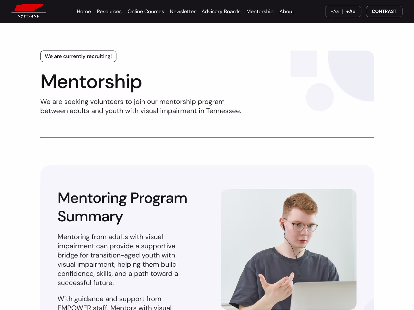
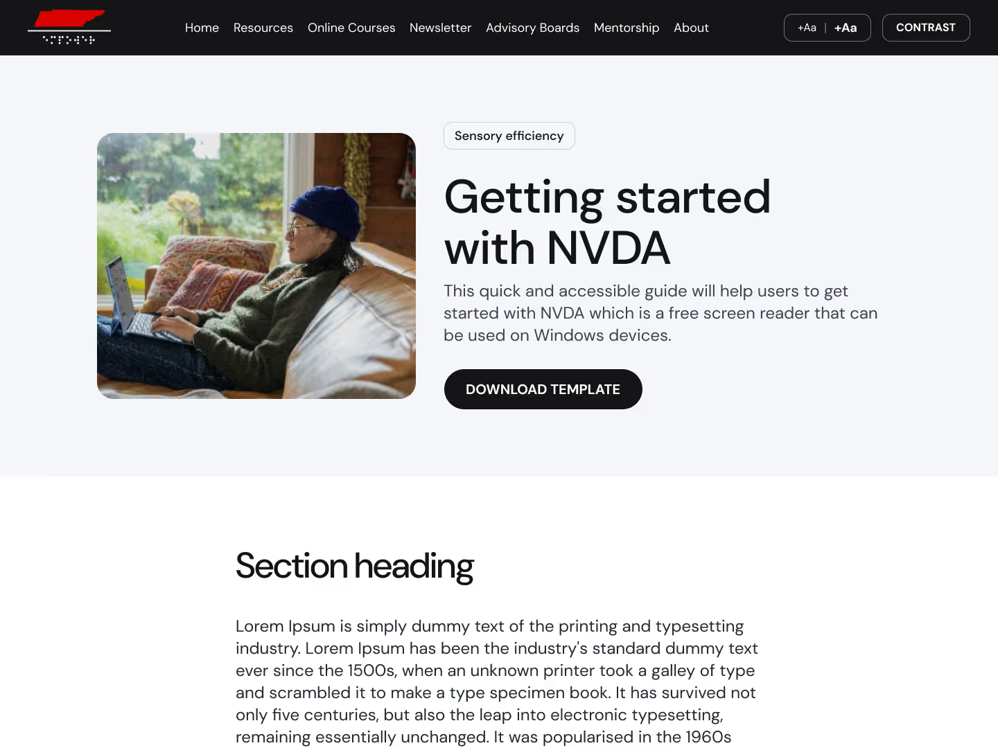
We have crafted over 30 pages and templates, and we are delighted to showcase the most captivating ones to you.

I was impressed with the excellent (above and beyond) communication and quick task completion. By the time of the launch, I felt like one of the team. it was very collaborative, and I am looking forward to continuing the partnership. I've had a few Advisory Board members (who are blind) navigate the website and they said they were impressed. It takes a lot of work, and I appreciate the partnership.
Like what you see? Don't let your website idle another day
START A PROJECT